
Logo Redesign Trends in the USA: 2026 Guide for US Businesses
A strong brand identity often starts with choosing the right logo design services, but even a recognizable logo may eventually stop representing a business effectively. Companies expand, introduce new services, enter new markets, change their positioning, and communicate with customers across more digital channels. As those changes happen, an identity that once worked well can begin to feel difficult to use or disconnected from the business it represents.
A logo redesign provides a way to modernize that identity without automatically abandoning everything customers already recognize. Shopify describes logo redesign as creating a new or significantly updated version of an existing logo to reflect a company’s current identity, offerings, values, or target customers.
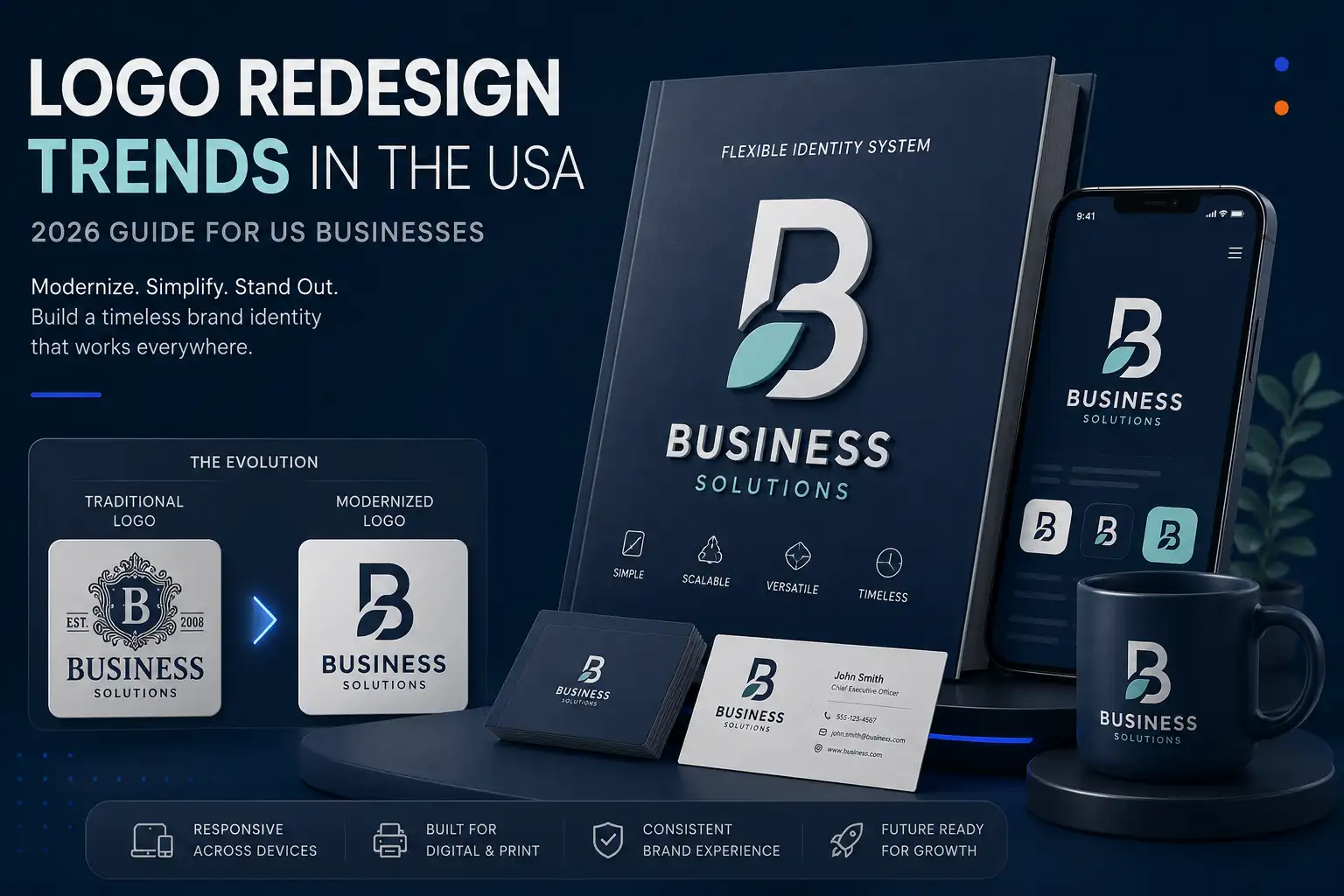
For US businesses considering a redesign in 2026, the important question is not simply, “What logo style is popular?” It is whether the updated logo is easier to use, more distinctive, appropriate for the company’s current position, and flexible enough for the places where the brand appears today.
What Is a Logo Redesign and Why Are US Businesses Doing It?
A logo redesign is an update to an existing visual identity rather than simply creating a logo from nothing. The scope can range from changing typography, colors, shapes, or layout to developing a substantially different visual direction.
For a business that already has recognition in its market, the challenge is balancing change with continuity. A redesign should solve a business or communication problem rather than exist simply because the current logo feels old.
Logo Redesign vs Logo Refresh vs Rebranding
These terms are related, but they describe different levels of change.
A logo refresh generally keeps the fundamental identity while refining selected elements such as color, typography, spacing, or other visual details. A logo redesign involves more substantial changes to the existing logo. Shopify makes this distinction primarily through the scope of the visual changes involved.
A rebrand is broader still. Canva describes a brand refresh as an update to the brand’s image without fundamental changes, while a rebrand can involve a fundamental transformation of the brand identity, including positioning and verbal as well as visual elements.
That distinction matters because changing a logo will not solve a positioning problem that exists across the entire business.
Why Businesses Outgrow Their Original Logos
A company may have started with a logo designed around its original products, audience, market, or business model. Years later, that same logo may communicate a much narrower story than the company actually represents.
Shopify identifies business evolution, new audiences, and new competitors among the reasons businesses redesign logos. Adobe similarly points to expansion into new markets, new audiences, new products, and changing business models as situations that can create a need to reconsider a visual identity.
For example, a company that originally served one local customer group may eventually serve customers across multiple markets. The original logo might still be recognizable, but its visual language may no longer communicate the company’s broader role.
How Digital Platforms Have Changed Logo Requirements
A modern logo may appear in a website header, social profile, mobile interface, email, digital advertising, marketplace listing, presentation, packaging, signage, or very small browser and interface areas.
That creates a practical design problem: the same detailed logo cannot necessarily perform equally well at every size.
Responsive logo systems address this by creating variations for different contexts. A full lockup can be used where there is sufficient space, while a simplified mark can be used at smaller sizes.
The goal is not to make every version look identical. The goal is to preserve recognizable brand characteristics while making the identity usable in different environments.
The Biggest Logo Redesign Trends in the USA in 2026
The 2026 LogoLounge trend report provides a useful view of current logo-design directions. Its analysis is based on more than 30,000 logos and identity systems from significant projects worldwide, so it should be understood as a global design-industry observation rather than a statistical survey of US businesses.
Several of the observed directions are particularly relevant when an established US business is deciding how to modernize its identity.
Image placement: Place a trend overview graphic immediately after this introduction.
Recommended size: 1200 × 675 px
Suggested visual: A clean grid showing several abstract logo-design directions without copying specific LogoLounge examples.
Simplifying Complex and Outdated Logos
Simplification remains useful when an existing identity contains too many details, decorative elements, or small features that disappear at reduced sizes.
The objective is not to remove character simply to make a logo minimalist. Instead, designers should identify which parts of the existing mark actually carry recognition and remove or refine elements that make the logo harder to read or reproduce.
This approach is particularly useful when a business has accumulated years of visual additions around an original mark.
Creating Responsive Logo Systems
Responsive logo design treats the logo as a system rather than one fixed graphic.
A large version may include the complete wordmark and symbol. A smaller version may remove secondary elements, while an icon or simplified mark can serve very small applications. Responsive-logo guidance describes this progressive adaptation as a way to maintain recognition across different sizes and contexts.
For an established business, this can be more valuable than simply redrawing the original logo.
Modernizing Typography
Typography can significantly change how an established logo feels without requiring a complete departure from its identity.
Shopify notes that font is one of the core elements that can be changed during a logo redesign, while Adobe recommends researching typefaces carefully because typography affects the impression created by a logo.
The 2026 LogoLounge report also identifies several typographic directions, including expressive letterforms, slanted characters, and unusual interventions within wordmarks.
For a redesign, however, the goal should be relevance rather than copying a fashionable type of treatment.
Refreshing Brand Colors
Color is another relatively direct way to modernize an established identity.
A business may retain its recognizable primary color while adjusting saturation, contrast, supporting colors, or the relationship between the logo and its surrounding visual system. Shopify identifies color as a central component of logo redesign, while Adobe recommends considering how logo colors interact with existing customer experiences and brand materials.
The strongest color update is one that supports the brand rather than simply following whatever palette happens to be fashionable.
Introducing Subtle Depth and Dimension
The 2026 LogoLounge report identifies a renewed interest in dimensional visual treatments, gradients, glow, depth, and rendered forms. Its discussion of trends such as Faders and Roll Over shows how three-dimensional qualities and controlled gradients are appearing in contemporary identity work.
For a redesign, subtle depth can be useful in selected applications while a simpler flat version remains available for situations where reproduction requires it.
This is especially important because a visually rich treatment should not become the only version of the logo.
Creating More Distinctive Brand Shapes
Current logo work is also experimenting with geometric structures, negative space, directional elements, and modular forms.
LogoLounge’s 2026 report highlights directions including Colorforms, Quad Quivers, Open Axis, Slash Bar, Echo Arcs, and Tri-Link. These approaches use relatively controlled visual components to create distinctive marks and relationships between shapes.
For a redesign, the lesson is not to copy one of these shapes. It is to look for a visual structure that can make the business identifiable without relying on generic symbols.
Making Logos More Flexible for Digital Platforms
A redesign should consider where the logo will actually appear.
A detailed horizontal lockup may work beautifully on a desktop website but become difficult to read in a small social profile or interface element. Responsive identity systems solve this through purpose-built variations rather than repeatedly shrinking the same artwork.
This makes flexibility a practical redesign requirement rather than merely a stylistic preference.
Adding Motion and Animated Logo Applications
Motion is becoming more relevant to identity systems, particularly where brands communicate through digital interfaces, video, and interactive experiences.
LogoLounge’s 2026 report describes Phasers, a direction in which logo elements are shown through sequential positions rather than simply implying continuous movement. The report also describes identity systems becoming more fluid and variable.
That does not mean every company needs an animated logo. For many businesses, a strong static logo remains the primary asset, with motion treated as an optional extension.
Bringing More Human Personality Into Brand Identity
A redesign does not have to make an established business look colder or more corporate.
Expressive typography, distinctive shapes, unusual negative space, and controlled visual irregularities can give an identity more character. The 2026 LogoLounge report shows several current directions that explore these qualities.
The important distinction is between personality and decoration. A distinctive detail should reinforce the brand’s character rather than make the logo difficult to understand.
Using AI as a Design Tool Without Losing Brand Originality
AI and advanced rendering tools are influencing contemporary identity work. LogoLounge’s 2026 report specifically discusses the continued impact of AI and advanced rendering tools, including increasingly dimensional and tactile visual treatments.
For businesses, the useful question is not whether AI can produce logo concepts. It is whether the final identity is original, strategically appropriate, technically usable, and distinctive enough to represent the company.
AI can assist exploration, but a business should not mistake fast visual generation for a complete identity strategy.
Why Do Businesses Redesign Their Logos?
A logo redesign should have a reason behind it. Without a clear problem to solve, changing a familiar identity can introduce unnecessary risk.
Adobe warns that changing a logo too often can confuse or alienate an audience, while Shopify recommends beginning with a clear understanding of why the redesign is needed.
The Existing Logo Looks Outdated
A logo can begin to feel disconnected from the visual language of its market. This does not automatically mean it needs to be replaced, but an outdated appearance can be a valid reason to evaluate whether a refresh or redesign is appropriate.
Adobe notes that dated imagery can make a business appear out of touch with current tastes.
The Logo No Longer Represents the Business
If the logo communicates an old product, narrow service, outdated positioning, or previous business identity, it may no longer tell an accurate story.
Shopify recommends evaluating the existing logo against the company’s current identity, offerings, values, and target customers.
The Company Has Expanded or Changed Direction
Expansion, diversification, new products, and new markets can make the original identity less appropriate.
Adobe specifically identifies growing businesses, new audiences, new products, and changes to business models as circumstances that can create an opportunity for logo redesign.
The Logo Does Not Work Well on Digital Platforms
A logo that looks good on a printed brochure may not work equally well as a small digital icon.
Responsive logo systems address this by providing different versions optimized for different display sizes.
The Business Needs Better Brand Differentiation
As markets become more crowded, an established logo can begin to resemble the visual language used by competitors.
Shopify identifies new competition as one reason for redesigning a logo, while Adobe emphasizes the importance of originality, memorability, and differentiation.
The Existing Identity Is Inconsistent
A logo redesign may expose a broader consistency problem.
Canva notes that when a brand is refreshed, updated elements need to be applied across the organization so the identity remains consistent.
If the website uses one version, social media another, and printed materials an outdated version, the problem may be bigger than the logo itself.
Signs Your Business May Need a Logo Redesign
There is no universal timetable that says every business should replace its logo after a specific number of years. The more useful approach is to examine whether the existing identity still performs its job.
Your Logo Is Difficult to Read at Small Sizes
If important details disappear when the logo becomes small, the business may need simplified versions or a redesigned structure.
Responsive logo guidance specifically addresses this problem by creating versions for different size ranges.
Your Logo Looks Too Similar to Competitors
If customers can easily confuse your logo with other companies in the same category, differentiation deserves attention.
A redesign can provide an opportunity to examine shapes, typography, color, and visual structure from the perspective of competitive distinction.
Your Branding Looks Different Across Platforms
Inconsistent logo versions can make an otherwise established company look less organized.
A redesign project can therefore include a defined set of logo variations and usage rules instead of delivering one file and leaving the business to adapt it independently.
Your Logo Depends on Outdated Design Styles
Not every older logo is a problem. Some identities remain effective because their underlying concept is strong.
The question is whether the visual treatment still communicates what the business wants customers to understand today. Adobe recommends evaluating trends carefully rather than changing a logo simply to follow them.
Your Current Logo Does Not Match Your Target Audience
A company’s audience can change over time.
When the intended audience changes, the logo may need to evolve so its typography, color, visual tone, and overall presentation better support the company’s current positioning. Shopify and Adobe both identify audience changes as a reason for reconsidering an identity.
Your Business Has Outgrown Its Original Positioning
Perhaps the strongest sign is a mismatch between what the company has become and what the logo still communicates.
If the business has expanded substantially, changed its services, entered new markets, or repositioned itself, an existing logo deserves a strategic review before the company invests in another round of marketing materials.
How to Redesign a Logo Without Losing Brand Recognition
The safest redesign is usually not the one that changes the most. It is the one that changes the right things.
Shopify recommends evaluating the old logo, identifying elements worth keeping, and preserving characteristics that resonate with an existing audience.
Identify the Elements Worth Keeping
Start by separating the logo into its components:
- symbol
- wordmark
- typography
- colors
- shapes
- proportions
- negative space
- overall structure
Some elements may be weak while others may already carry recognition.
Preserve Important Brand Recognition
A recognizable color, symbol, letterform, or shape can provide continuity during a redesign.
The objective is to give existing customers enough familiarity to understand that the business has evolved rather than disappeared.
Shopify specifically recommends retaining elements that resonate with loyal customers when appropriate.
Modernize Rather Than Change Everything
If the core concept is still useful, a controlled redesign may produce a better result than starting from zero.
That could mean refining typography, simplifying a symbol, correcting proportions, adjusting color, or developing a cleaner arrangement.
Adobe also warns that following trends without considering the brand can create unnecessary risk.
Create Multiple Logo Variations
A professional redesign should consider the environments in which the identity will be used.
A complete system can include a primary logo, compact arrangement, symbol or icon, and other size-appropriate variations. Responsive-logo guidance supports this approach for websites, social profiles, mobile interfaces, and other contexts.
Test the Redesigned Logo in Real Applications
Do not judge the redesign only on a large design-board presentation.
Place it on:
- the website header
- mobile screens
- social profiles
- digital advertising
- printed materials
- signage
- packaging where relevant
Adobe recommends exploring multiple options and testing designs because audience perception is an important part of the redesign process.
Logo Redesign Trends by Business Type
The same redesign approach does not work equally well for every business. A technology company, law firm, restaurant, and growing retailer may need very different visual solutions.
Logo Redesign for Technology Companies
Technology businesses often need identity systems that can work in digital interfaces, applications, websites, presentations, and social profiles.
A responsive structure can therefore be particularly useful. Current design directions involving dimensional effects, motion, geometric structures, and expressive typography may also provide creative possibilities, but they should be evaluated against the company’s actual positioning rather than adopted simply because they are current.
Logo Redesign for Professional Services
Professional services businesses often benefit from clarity and credibility more than excessive visual experimentation.
Law firms, consultants, financial businesses, healthcare-related professional services, and other established providers should evaluate whether typography, spacing, color, and symbol choices communicate the level of professionalism expected from their audience.
Logo Redesign for Retail and E-Commerce
Retail identities need to work across websites, product pages, social media, packaging, advertising, and sometimes physical stores.
A redesign should therefore consider both the complete logo and smaller versions that remain identifiable in digital environments.
Logo Redesign for Restaurants and Hospitality
Restaurants and hospitality businesses often have many physical and digital applications for their identities, including menus, signage, websites, social profiles, packaging, merchandise, and promotional material.
A redesign should preserve enough personality to make the business memorable while ensuring the mark remains readable and reproducible.
Logo Redesign for Small and Growing Businesses
Small businesses do not necessarily need a dramatic rebrand when they grow.
A carefully planned redesign may be enough to remove limitations from the original logo, accommodate new services, improve digital use, and present a more established identity.
Adobe notes that growing businesses often encounter strategic changes involving audiences, products, and business models, creating natural opportunities to reconsider their visual identity.
Should You Redesign Your Logo or Keep the Existing One?
A logo should not be redesigned merely because a new style has appeared.
The decision should begin with the business problem.
When a Logo Redesign Is Worth Considering
A redesign deserves serious consideration when the existing identity:
- no longer reflects the company’s direction
- limits how the business presents itself
- is difficult to use digitally
- fails to differentiate the company
- looks disconnected from the intended audience
- represents products or services the company no longer focuses on
These situations align with the reasons identified by Shopify and Adobe for reconsidering an established logo.
When a Logo Refresh May Be Enough
A refresh can make more sense when the underlying identity is still strong.
If customers recognize the symbol and the overall concept remains appropriate, smaller adjustments to typography, color, proportions, spacing, or other visual details may solve the problem without replacing the identity completely.
When a Complete Rebrand Makes More Sense
If the problem extends beyond the logo, redesigning the logo alone may not be enough.
Canva distinguishes a brand refresh from a rebrand by the depth of change: a rebrand can affect the fundamental identity, positioning, visual system, and verbal elements of the brand.
In that situation, the business should first address the broader brand strategy and then determine how the logo fits within the new identity.
What to Look for in a Professional Logo Redesign Service
Choosing a redesign provider should involve more than looking at a portfolio thumbnail.
The business needs to understand how the designer approaches the existing identity, how concepts are developed, how feedback is handled, and what the final identity will need to accomplish.
Custom Design Instead of Generic Templates
A redesign should address the specific business rather than simply placing its name into a familiar visual formula.
The objective is to create an identity that reflects the company’s current position and differentiates it from competing businesses.
Experienced Logo Designers
Look for designers who can explain why a particular direction is appropriate.
A good redesign process should connect design decisions to the business, audience, positioning, applications, and recognition requirements—not just personal aesthetic preference.
Multiple Design Concepts and Revisions
Businesses should understand how many concepts are included, how revisions work, and what happens if the initial direction does not solve the original problem.
Adobe recommends exploring multiple logo options and testing designs before finalizing the identity.
Complete Logo File Formats
Ask exactly what files will be supplied and whether they are appropriate for the intended uses.
A professional logo system may require scalable master artwork as well as digital exports and smaller variations. Responsive-logo guidance demonstrates why different versions and formats can matter across digital and print environments.
Consistent Brand Applications
A redesign should not end with the logo file.
The business should consider how the updated identity will be applied to websites, social profiles, marketing materials, presentations, packaging, signage, and other relevant touchpoints.
Canva emphasizes applying updated brand elements consistently across an organization when undertaking a brand refresh.
Support for Digital and Print Use
The final identity should be evaluated in both digital and physical contexts where relevant.
A logo that performs well in a website header but fails on signage or printed material is not a complete solution. The same principle applies in reverse.
How Much Should Businesses Consider When Planning a Logo Redesign?
The cost of a redesign depends heavily on the scope of the work.
Shopify notes that logo-related costs can range from a few hundred dollars for DIY tools to several thousand dollars for professional designers or agencies, while major corporate rebrands can involve substantially larger budgets.
For that reason, businesses should compare the scope and deliverables, not just the headline price.
Factors That Influence Logo Redesign Cost
Important cost factors can include:
- complexity of the redesign
- number of concepts
- number of revision rounds
- designer or agency involvement
- typography development
- responsive logo variations
- brand guidelines
- supporting identity elements
- final file formats
- digital and print applications
- additional brand strategy work
A simple logo adjustment and a complete identity system are fundamentally different projects, even if both are described as a “logo redesign.”
Freelancer vs Logo Design Agency
A freelancer may be appropriate when the project has a relatively focused scope and the business primarily needs the logo itself.
An agency may make more sense when the redesign involves broader brand work, multiple stakeholders, several applications, or a larger identity system.
The right choice depends on the complexity of the project rather than the label attached to the provider.
Why the Cheapest Redesign Is Not Always the Best Choice
Price should be evaluated alongside deliverables, process, originality, usability, and long-term application.
A low-cost redesign may appear attractive until the business discovers that it needs additional logo versions, editable source files, revisions, brand guidelines, or help adapting the identity across its marketing materials.
The better comparison is:
What problem will this redesign solve, what will I receive, and will the final identity work where my business actually needs it?
Final Thoughts on Logo Redesign Trends in the USA
Logo redesign in 2026 is less about replacing an old image with a fashionable new one and more about making an established identity fit the business it has become.
Current design observations point toward more flexible identity systems, expressive typography, geometric structures, dimensional treatments, motion, and adaptable visual frameworks. The 2026 LogoLounge report documents these directions across a large body of worldwide identity work, but it also makes an important point: trends are observations, not instructions.
For a US business, the best redesign is therefore not necessarily the one that looks the most like a 2026 trend board.
It is the one that solves the company’s actual identity problem.
Modernize the Logo Without Losing the Brand
Start with what already has value.
Identify the elements customers recognize, determine what has become outdated or restrictive, and then decide which parts should be refined, replaced, simplified, or expanded into a responsive system.
This approach gives the redesign a clear purpose while protecting useful brand recognition. Shopify specifically recommends evaluating the existing logo and preserving elements that resonate with loyal customers where appropriate.
Choose Long-Term Brand Value Over Short-Term Trends
A logo may need to look current, but it also needs to remain useful after the current design cycle has passed.
Adobe’s guidance on design trends recommends questioning trends before adopting them and emphasizes that redesign decisions should be connected to the brand’s goals and audience rather than fashion alone.
For businesses that already have an established identity, that distinction matters. The goal is not to make the logo look new for the sake of looking new. The goal is to create a stronger identity that represents the business today and can continue working as the business grows.
At Digital Zone Consulting, businesses can evaluate logo design as part of a broader digital brand presence, with the focus on creating a professional identity that can work across the channels where modern businesses actually communicate. For businesses exploring their options, our guide to the best logo design services in the USA provides a broader look at what to consider when choosing a professional logo design service.
If your existing logo feels outdated, difficult to use, or no longer represents the direction of your company, a professional redesign can be a practical next step.
Ready to Discuss Your Logo Project?